Scope :The Project was Designed
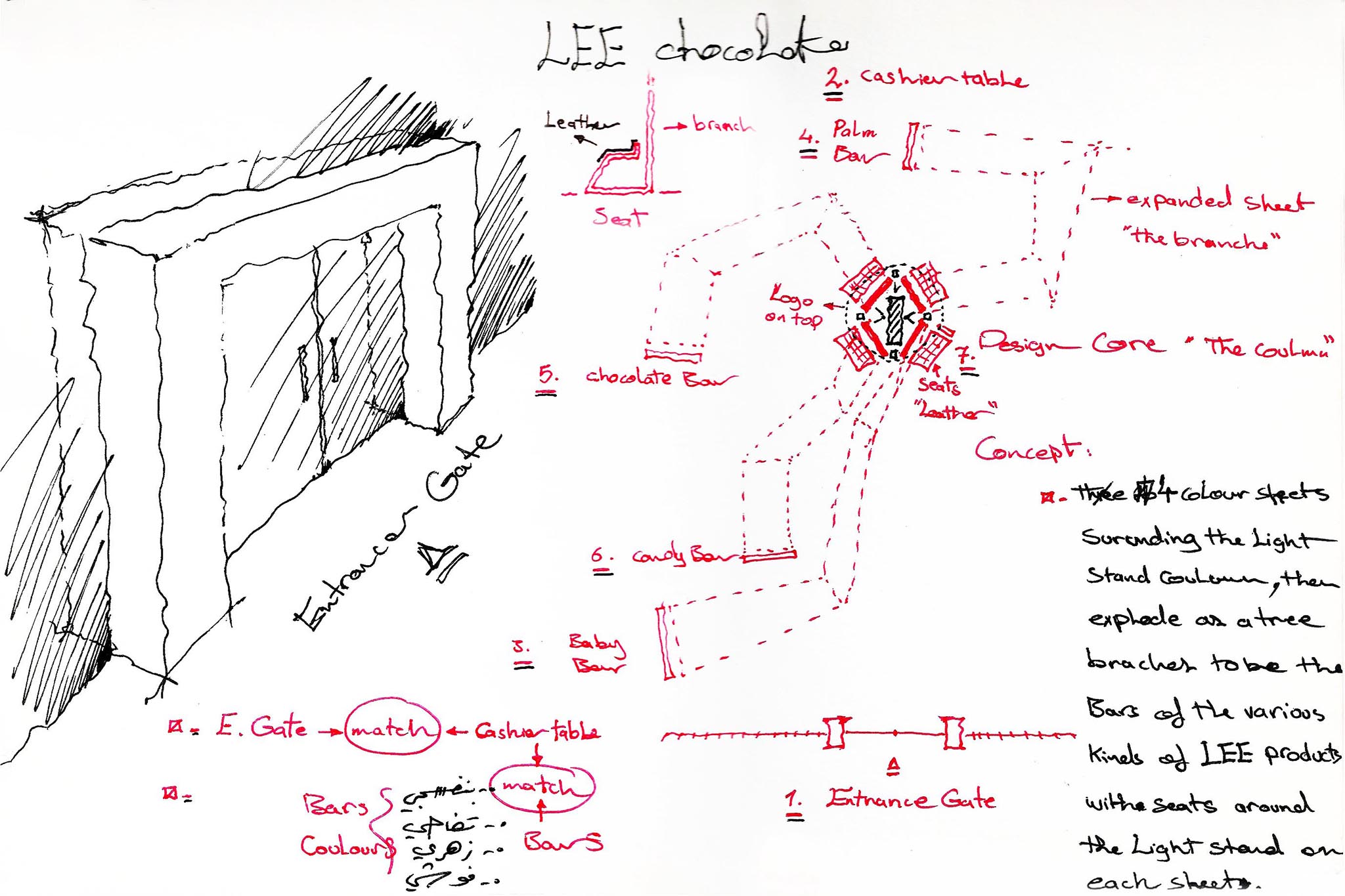
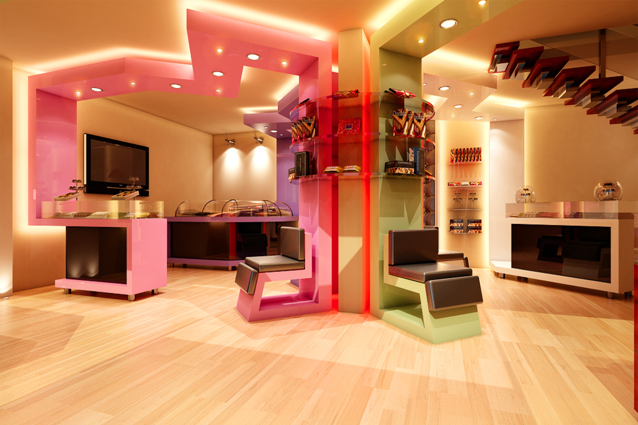
Description : Design Concept The design concept is primarily based on customer comfort and movement, with the movement originating from the center of the space.
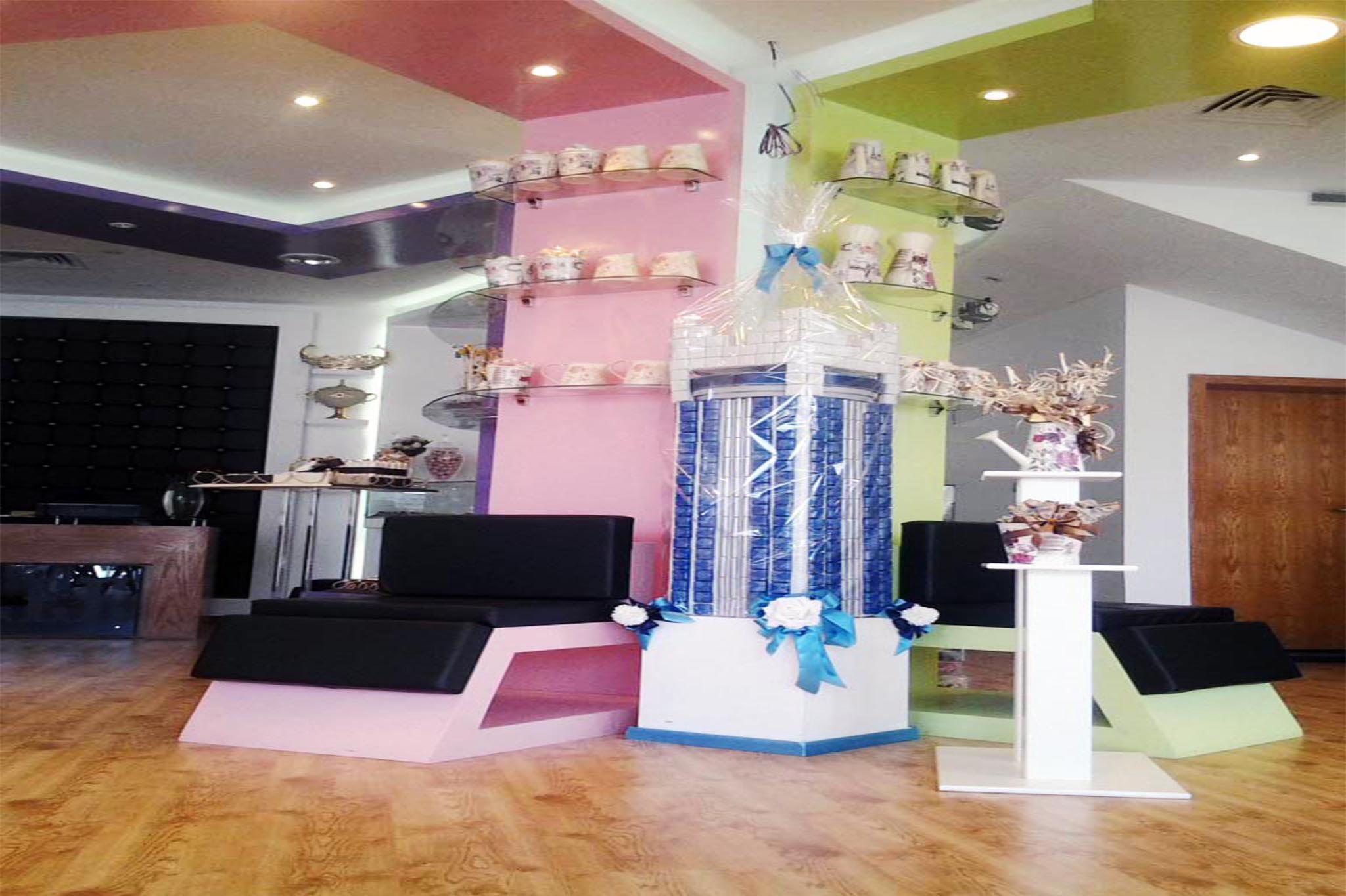
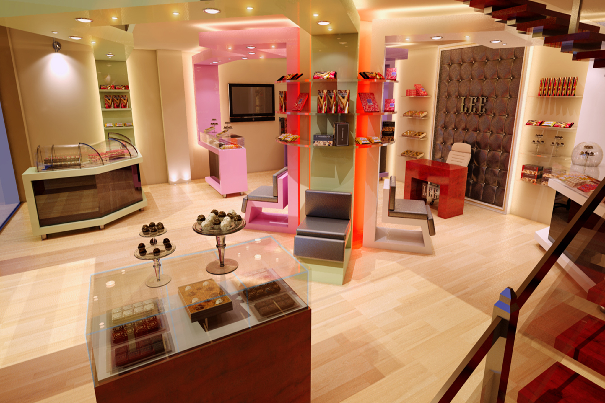
The central area was developed into what we called the “Tray Tower”, designed to display the chocolate products, forming the core element of the design. From this central point, the concept of customer comfort and circulation was integrated into an elegant design that radiates outward from the central column.
Four central chairs surround the column, symbolizing customer comfort. Leather was selected for the seating because of its sense of warmth, intimacy, and comfort. From these four chairs, four elegant circulation paths extend outward, creating a dynamic sense of movement enhanced by concealed lighting that emphasizes the direction of the paths toward the display and sales counters.
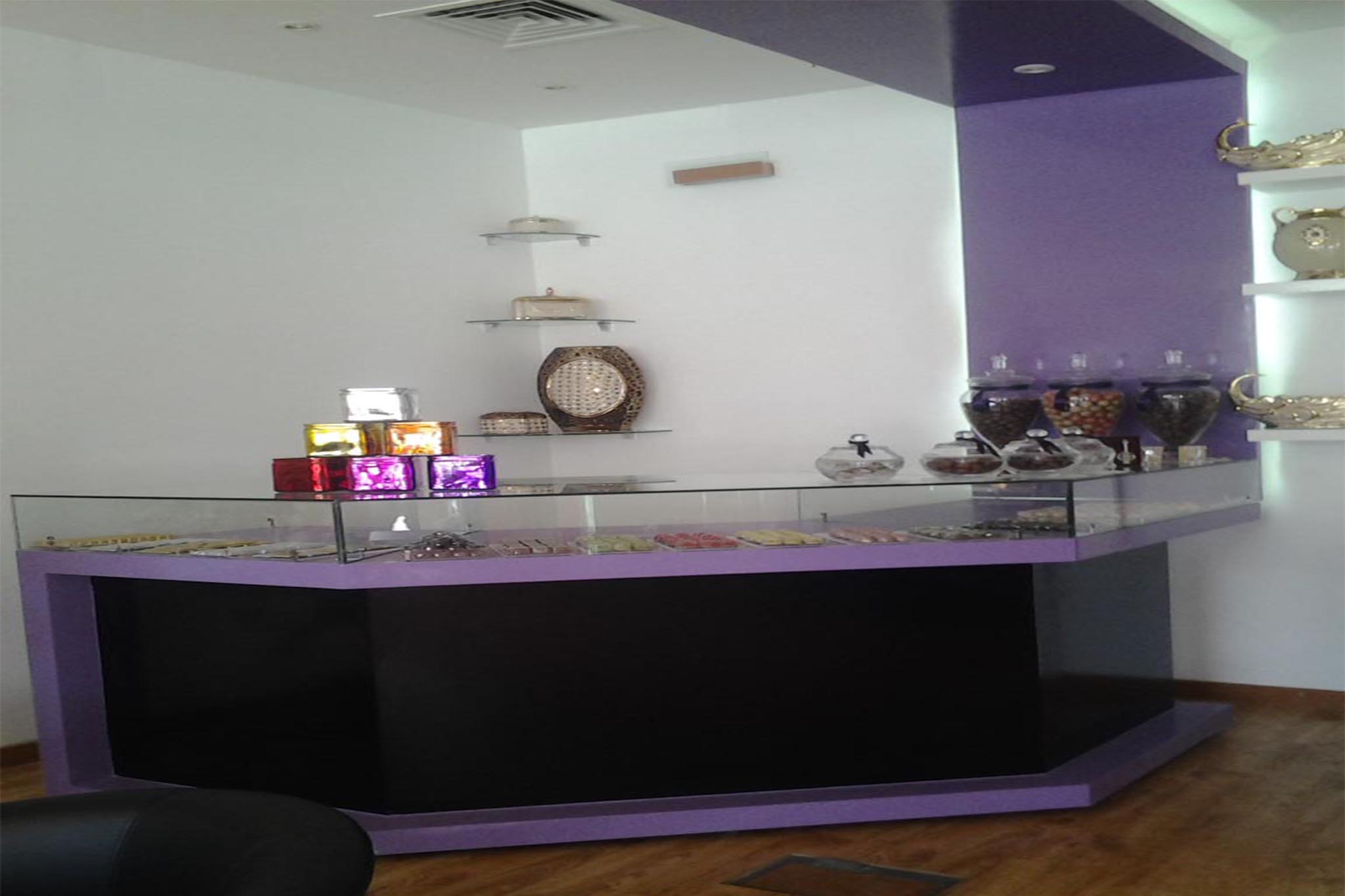
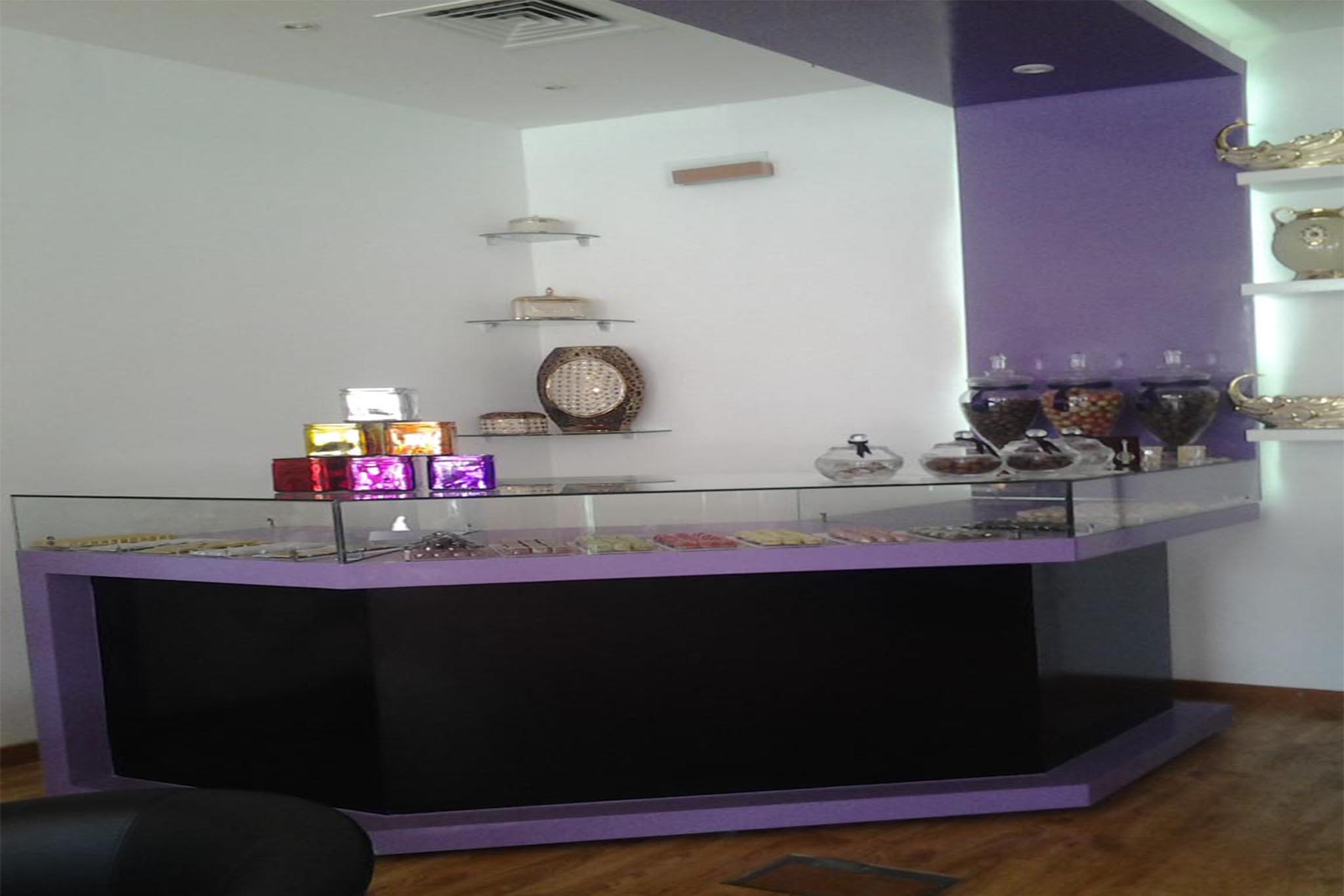
The space includes four sales counters, each with its own starting point, all originating from the center and reflecting the concept of customer comfort.
The design was developed from the important relationship between customer service and comfort, which should be a fundamental quality of a chocolate retail store. This relationship was expressed through a visual, formal, and functional connection between the four bars serving the different Chocolat Li products and four comfortable leather sofas arranged around the main product display tower—the “Tray Tower.”
The tower represents the nucleus from which this relationship originates, while the displayed products emerge between the layers of the central concept: the duality of comfort and service.
This duality—Service–Comfort / Sofa–Service Bar—was also incorporated into the concealed lighting elements throughout the space, in addition to reinforcing the visual connection between these two complementary elements.
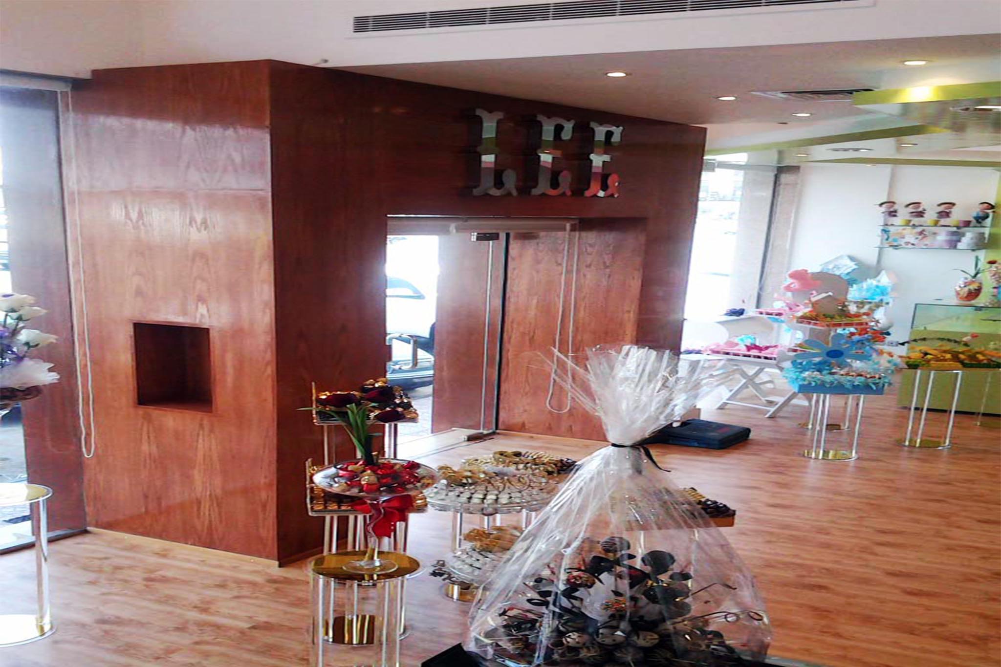
It is also worth noting the symmetry between the starting and ending points of the customer journey within the store: the entrance gateway and the cashier counter. Accordingly, a monumental wooden entrance portal was designed to echo the cashier counter in terms of material, color, proportions, and form.
A dark brown color was selected as the unifying color for both elements, representing the rich and distinctive color of chocolate itself.